From guidelines to a working system
I moved the team off Adobe XD onto Figma in 2021, so when the rebrand landed there was somewhere to put it. Over forty people were using XD, so I planned the migration properly — demos and workshops, team by team, until people were comfortable working in it.
The guidelines set the direction; what they became on screen was still open, and I worked that through with our Creative Director.
Type that survives three languages
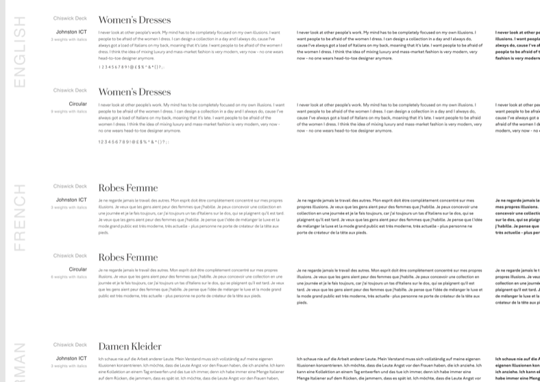
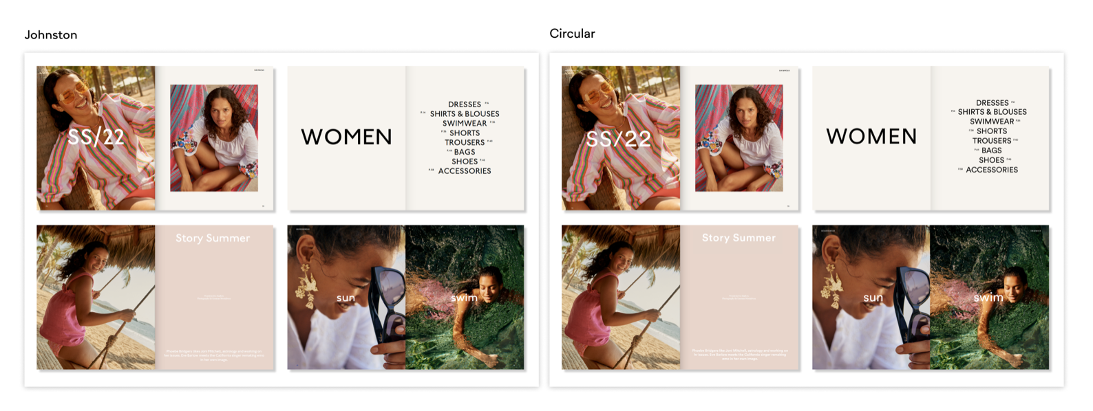
It had to work as Browse UI and give Creative room to be expressive, in English, French and German. Circular won on readability and on weights — more weights meant Creative had somewhere to go without another family in the stack.
The library everything else was built on
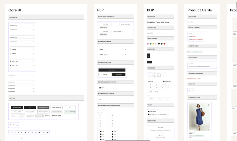
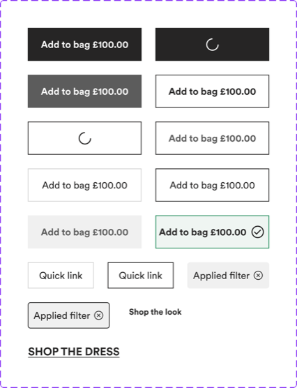
I built and maintained the product UI kit — Core UI, PLP, PDP, product cards, every set named and bounded — alongside a web content library for the creative team.
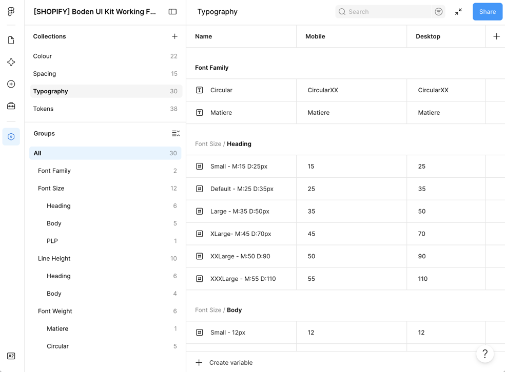
Underneath, it runs on variables rather than styles: colour, spacing, typography and tokens, with Mobile and Desktop as modes.
Two more libraries came off the back of it. Graphics & Artwork needed Email and Social, and rather than build those myself I showed them how to consume from the kit and author their own, so those two are theirs to run.
Quick enough to be worth building
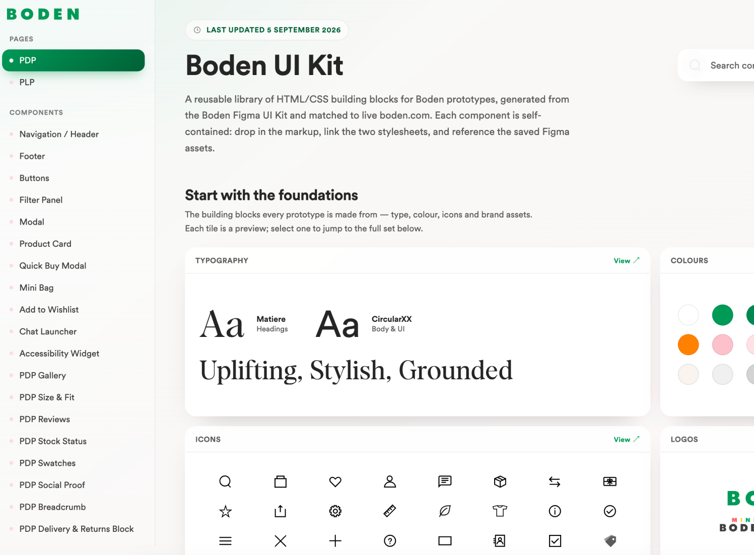
When AI tooling arrived, building in code got quick enough to be worth doing. So the kit went into code, built with Claude Code reading the Figma file through Figma's MCP server — so components come out of the library itself rather than being redrawn from a screenshot of it.
A quick idea becomes something you can click the same day. Stakeholders get something to interact with, which makes for a richer conversation — and the handover to engineering is smoother, because they are looking at a working reference rather than a description of one.
They come out close enough to the real thing that we had to give the prototypes their own favicon. Otherwise you genuinely could not tell which tab was live and which was a prototype.

Somewhere for it to live
I worked with our Cloud Engineer to put the kit in a GitHub repo and get it hosted. Until then, every prototype was a standalone page of HTML and CSS, built from scratch each time. With the kit somewhere it could be pulled from, we could start building at scale instead.
Make an outfit of it
The brief was to improve our outfitting proposition: how a product page shows a whole look, and how someone buys more than one piece of it.
I built it in the kit instead of drawing it. Tap a garment on the flatlay and you get that product's Quick Buy; tap Get the look and a panel slides in with every item in the outfit, priced and ready to add.
Handing that to our third-party partner took a few hours. Writing the same behaviour down as a specification would have taken days, and still left room to read it two ways.
It went live as an A/B test.
- Add to cart
- +3%
- Conversion
- +1.6%
Which way round, per task
We now pick the starting point rather than always opening Figma. It is a decision made at the top of a piece of work, based on what that work actually needs.
Some of it goes to code first. The prototype and its scenarios get built and worked through there, where the thinking is quicker, and come back into Figma afterwards so the library stays complete.
The rest starts in Figma as it always did, and the coded version is generated from the file once the design has settled.